


Health Tracking, Redefined
Incora is the first wearable earring designed to provide personalized health insights based on the menstrual cycle, leveraging in-ear sensors for highly accurate data on heart rate, sleep, and activity. Led the visual and product design for the connected app, driving creative direction, building functional prototypes, designing data visualizations, and delivering a robust UI Kit. Our work helped translate Incora’s groundbreaking science into a user-friendly experience, empowering women to better understand and optimize their health.
STYLE TILES
Establishing Visual Direction
Style Tiles are collections of colors, typography, textures, photography, and sample interface elements that capture the overall vibe of a product. They serve as an early checkpoint in the design process—helping teams align on a visual direction before diving deep into detailed product design. By presenting multiple style options side by side, they quickly surface preferences, uncover likes and dislikes, and guide conversations around look and feel.
The goal isn’t to deliver final UI components in this phase, but to establish a “North Star” for the product’s aesthetic. Once approved, the chosen Style Tile becomes the foundation for building a full UI kit and, ultimately, the product’s visual identity.
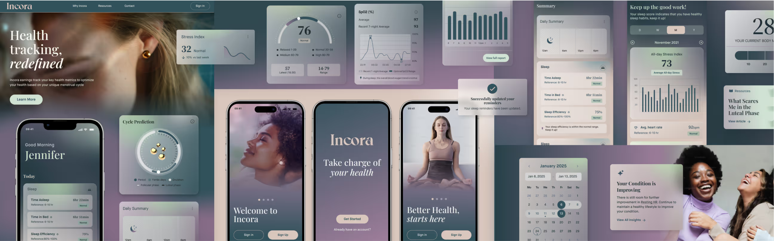
Concept One - Glass Horizon
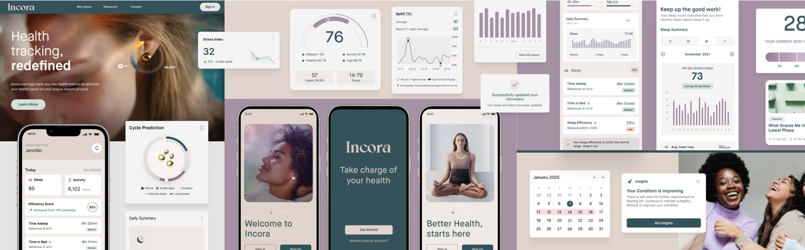
Concept Two - Clinical Clarity
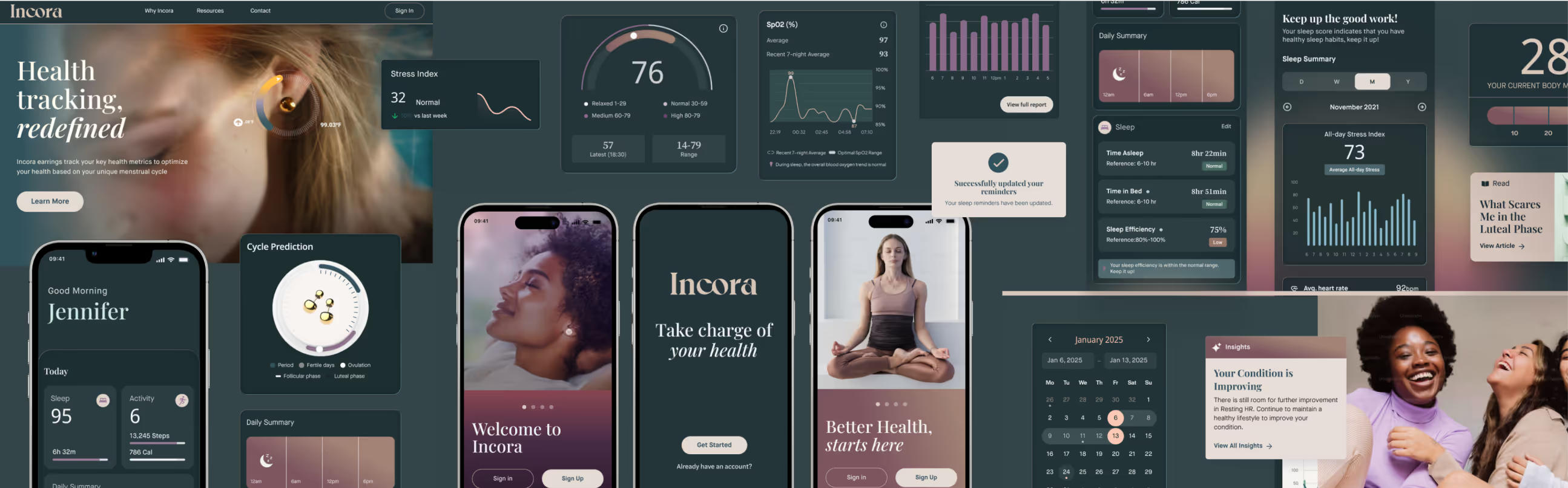
Concept Three - Elevated Balance
UX Design
Femovate led the UX design, creating simple, intuitive flows that make Incora’s health tracking easy to use and genuinely helpful day to day. From those early wireframes, we worked side by side with team at Femovate and the founders at Incora to evolve the app’s look and feel, giving it a unique style that’s equal parts science-driven, approachable, and beautiful.
Color Palette & Typography
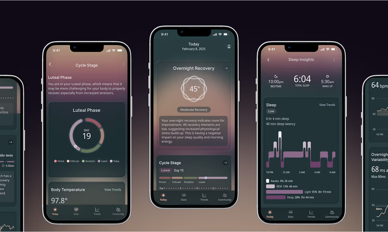
The selected direction embraced a darker, more elegant aesthetic. Deep gradients create a sophisticated backdrop that allows Incora’s data visualizations to stand out with clarity and precision. Accent colors are used sparingly to guide focus and highlight insights, keeping the overall look refined rather than overwhelming.
Typography was chosen specifically for its performance in data-rich interfaces. A modern sans-serif typeface, with a range of weights and crisp detailing, ensures charts, labels, and metrics remain highly legible. Paired with the dark palette, the typography establishes a visual system that feels both premium and purposeful.
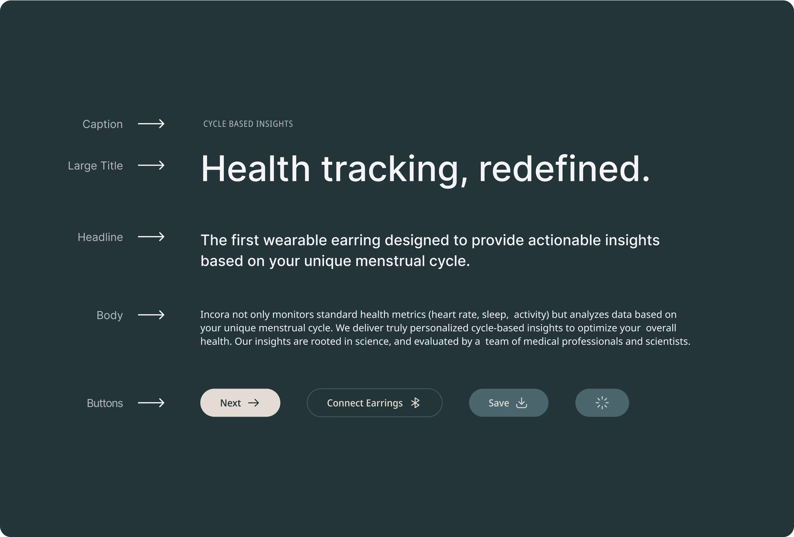
ILLUSTRATION & UI MOTION
The Stages of Recovery
To visualize overnight recovery, we designed a geometric flower inspired motif that grows from sparse petals on low-recovery nights to a radiant bloom on high-recovery nights. Animated prototypes demonstrated how the motif should evolve in real time, giving engineers a clear blueprint to build from while preserving both elegance and clarity.

DATA VISUALIZATIONS
Visualizing Health
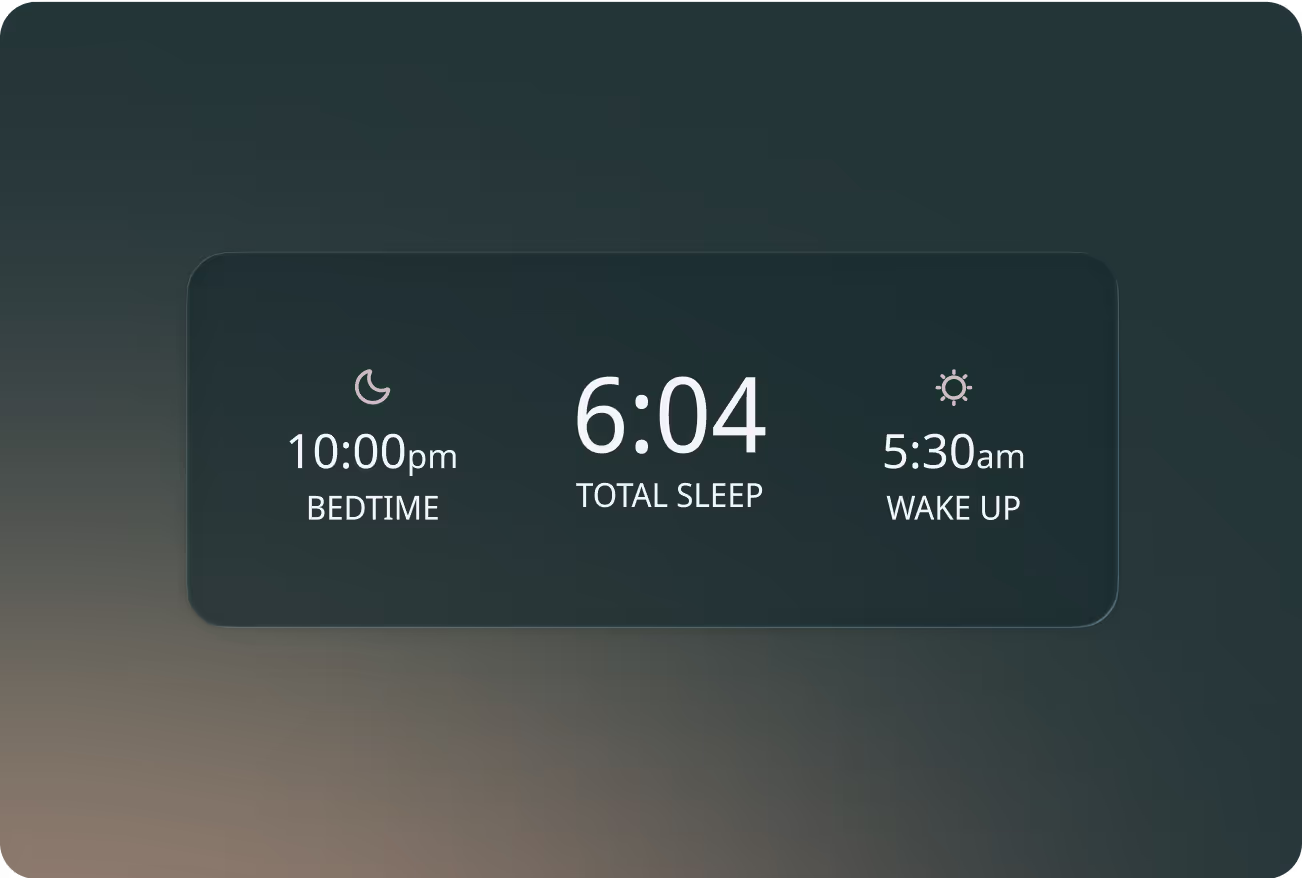
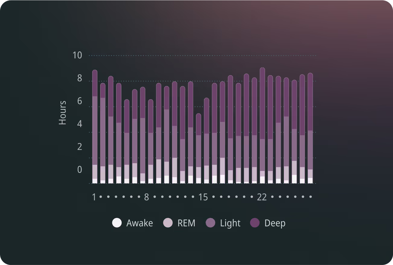
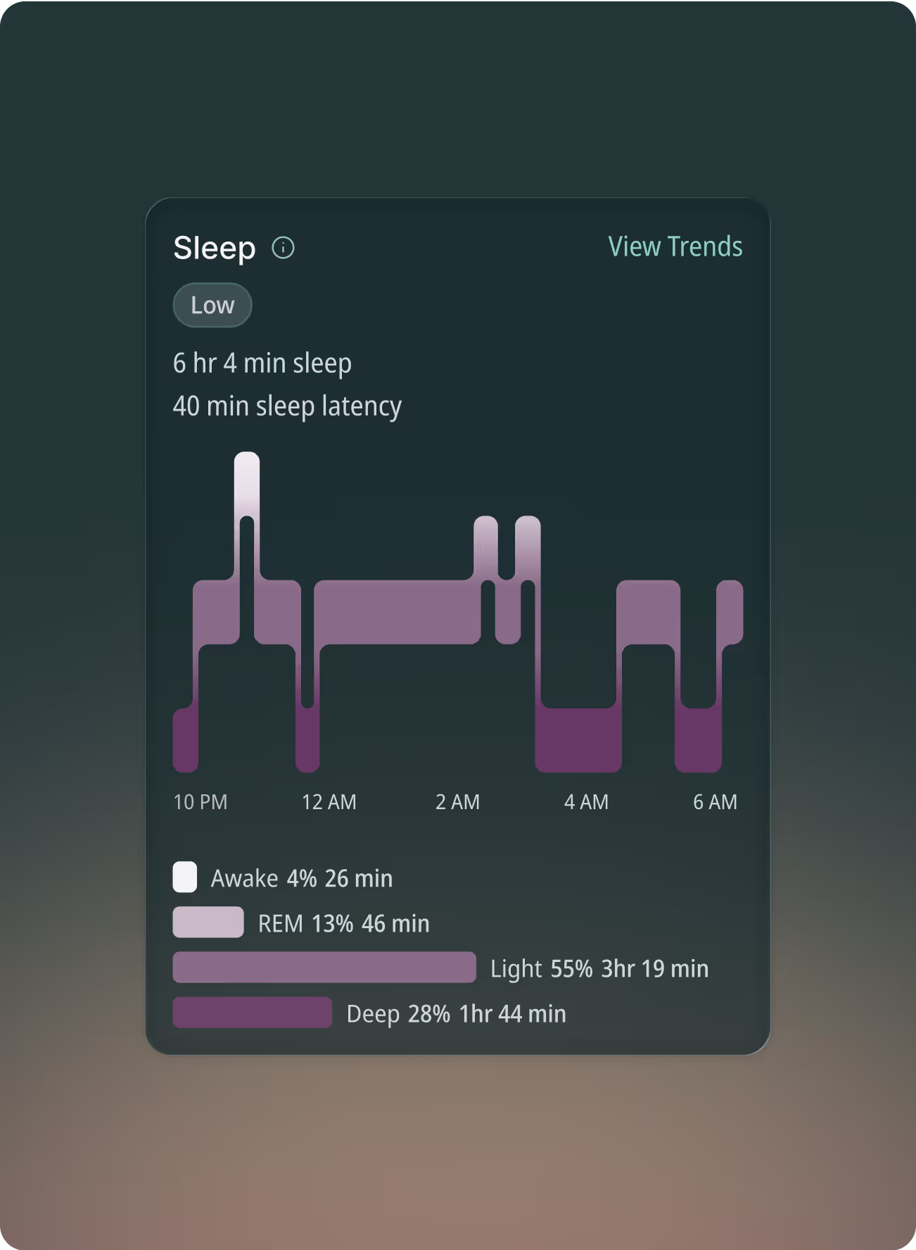
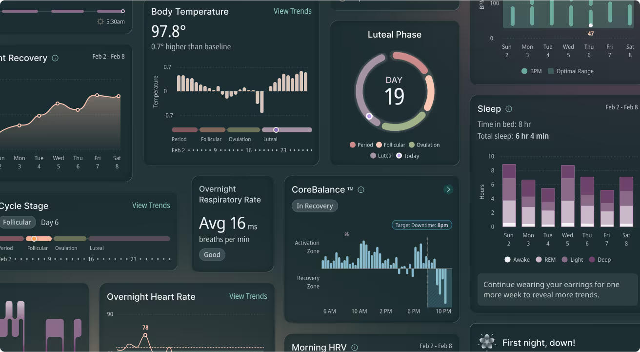
Because Incora’s value lies in turning raw biometric signals into meaningful insights, we placed a strong emphasis on the design of its data visualizations. Each chart and graph was crafted to feel clear and intuitive, even when displaying dense or complex information.
UI Kit
Robust Component Library
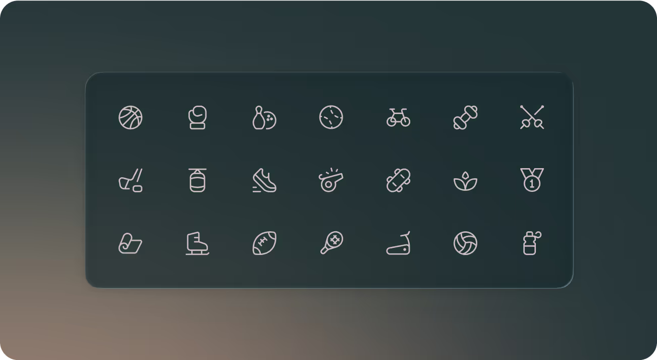
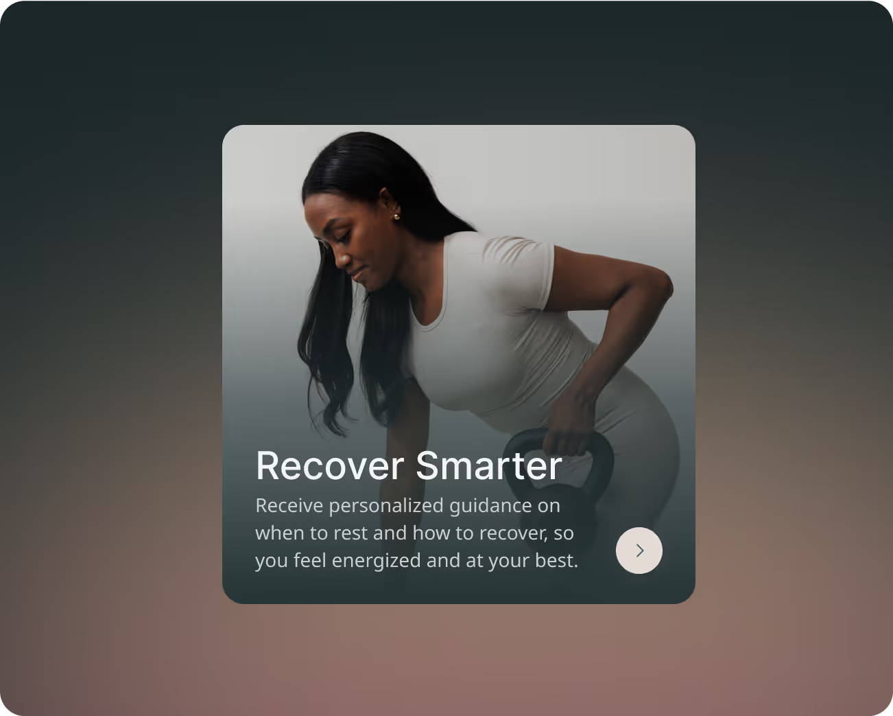
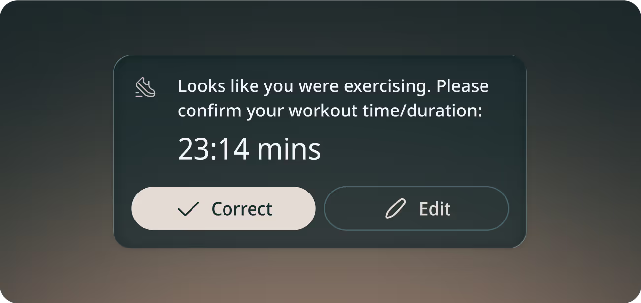
We delivered a robust UI Kit that included typography, color palettes, icons, and a full library of reusable components, from buttons and inputs to complex chart modules. This system gave engineers a clear blueprint for implementation and ensured every screen carried the same elegant, data-rich aesthetic. By serving as a single source of truth, the kit made it easy to scale the product quickly while maintaining consistency and quality.



Incora’s smart earrings were awarded a special mention from Time Magazine in the Wearable Technology category.
Read More
Incora’s innovative approach to women’s health was recognized as one of Fast Company’s 2025 Innovation by Design Awards honorees in the Health & Wellness category.
Read More